
This tutorial provides detailed instructions for understanding the enhanced features of the newly updated ProjectMark analytics interface.
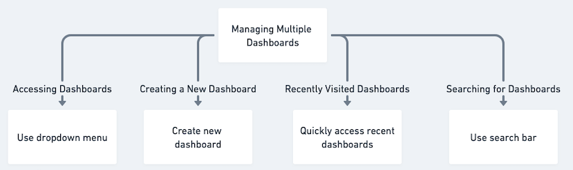
1. Working with Dashboard Options:
- Viewing Dashboards: Select from available dashboards using the top menu dropdown to switch between different company views.
- Dashboard Creation: Find the new dashboard creation option positioned at the dropdown menu's on top.
- Recent Dashboard Access: Easily return to previously viewed dashboards through the top-level quick access section.
Dashboard Search Function: For larger dashboard collections, utilize the keyword search functionality to find specific dashboards efficiently.
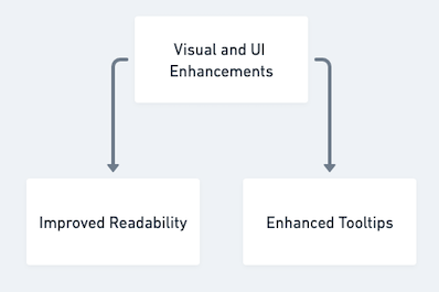
2. Interface and Display Improvements:
- Better Legibility: Modified text styling and dimensions boost clarity.
- Upgraded Information Boxes: Chart interactions now display more detailed and precise data previews.
3. Deal Pipeline Visualization:
- Pipeline Overview: The deal funnel chart illustrates each phase of your sales pipeline.
- Analysis Methods: Examine pipeline stages categorized by either monetary value or opportunity count.
- Dynamic Interaction: Select any segment of the chart to immediately access a comprehensive list of corresponding opportunities and their associated information.
4. Dashboard Component Controls:
- Custom Filtering: Implement specific filters for each dashboard component to focus data presentation.
- Time Period Selection: Customize time frames for individual dashboard elements.
Configuration Retention: Filter preferences and date range settings remain stored on the dashboard for subsequent sessions.

5. Streamlined Chart Development:
- Custom Field Organization: You can now choose any custom field to organize data on the x-axis. This allows you to generate charts for practically any data category within your opportunities.
6. Performance Enhancements:
Improved Experience: Major performance upgrades have been implemented for a more responsive and effective user interface.
